An Annotated Portfolio
of Poster Covers on Magazines,
1920s to 1990s
Journal of Magazine and New Media Research, 2002
Gerald Grow
Florida A&M University
ggrow@longleaf.net
Sidebar to "Magazine Covers and Cover Lines: An Illustrated
History,"
Journal of Magazine and New Media Research, 2002.
Return to main page.
|
These covers illustrate the "poster cover" that dominated sophisticated magazine design from the mid-1920s until the 1950s. A poster cover can be thought of as a picture suitable for framing -- or nearly so. Poster covers have few if any cover lines, and such cover lines are strongly overshadowed by the illustration. One of the major trends in 20th century magazine design was the gradual increase in the use of cover lines in those magazines that were usually considered leaders in industry and design, until, by the end of the century, cover lines threatened to dominate the cover photograph. |
|
Note on images: Some images have been slightly cropped, because they were too large to fit on a regular scanner. Others were photographed at an angle and are slightly distorted as a result. But you can still see them quite well. |
 |
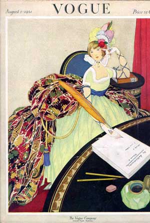 |
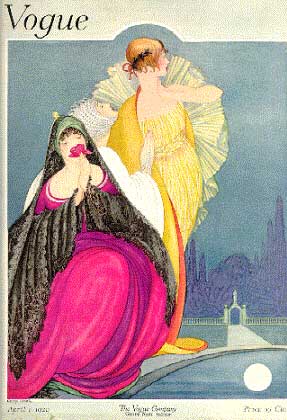
| Vogue, April 1920. These two covers come from a time when the most powerful images came not from photographs, but from illustrators. | Vogue, July 1921 |
 |
 |
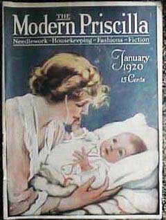
| Modern Priscilla, Jan. 1920 | Silk Textile, Jan. 1920 |
 |
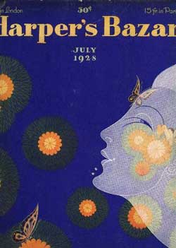 |
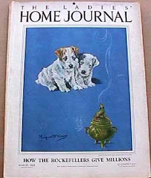
| Ladies' Home Journal, March 1925 | Harper's Bazaar, July 1928 |
 |
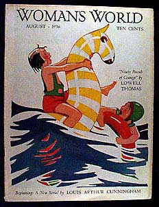 |
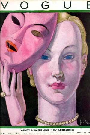
| Vogue, Nov. 1930. Underneath the artificial mask, you see the real make-up. At this time, Vogue was capable of that kind of self-reflective humor. | Woman's World, Aug. 1936 |
 |
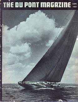 |
| Better Homes and Gardens, May 1934. A painting. Most similar covers today would use a photograph. The first hand-held Leica with interchangeable lenses came on the market in 1930, making photographs of such subjects widely available for the first time. | Dupont, Sept. 1937 |
 |
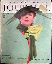 |
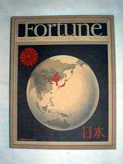
| Fortune, Sept. 1936: For years, Fortune used the double-framed cover, with the image visible through two openings. | Ladies' Home Journal, October 1934. Some say that the images on covers stand for the reader's ideal image of herself. If so, how does today's ideal image of the LHJ reader differ from this one? |
 |
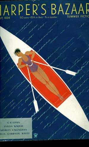 |
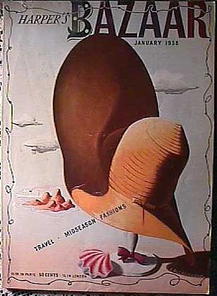
| Harper's Bazaar, Jan. 1938. Remington and others have told how European modern artists fleeing Fascism emigrated to America and worked for fashion magazines. These covers are versions of abstract modernist art. | Harper's Bazaar, July 1934 |
 |
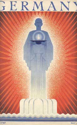 |
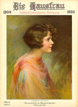
| Die Hausfrau, March 1932 | Germany, May 1936. Is it possible that the poster cover implies a widespread agreement about some single thing that is of utmost importance? And that current covers, with their multiple cover lines, speak of a readership with multiple competing interests? |
 |
 |
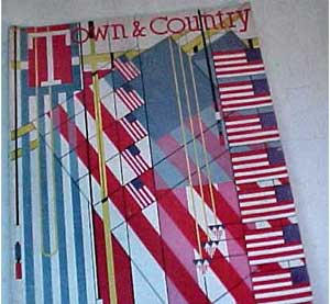
| Town and Country, July 1937 (the part cut off at the bottom contained more of the same image): An exuberance of pure design, without reference to the issue's content beyond the association with July 4th. | Vogue, June 1936. Around this time, color photography began to compete with graphic illustrations on magazine poster covers. A photographic cover like this was still a novelty. |
 |
 |
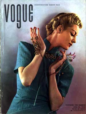
| Woman's Home Companion, Nov. 1939 | Vogue, June 1940. Unlike most magazines, which kept their logos constant, Vogue wrote its logo many different ways. |
 |
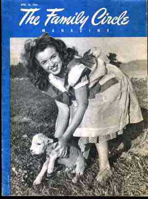 |
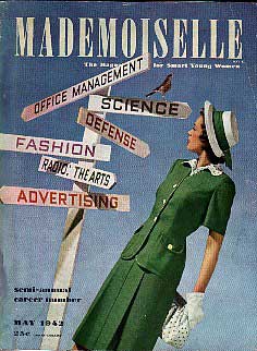
| Mademoiselle, May 1942. The war catapults women into jobs formerly dominated by men. | Family Circle, 1946. That's Norma Jean Baker, before she became Marilyn Monroe. Note that the picture is black and white, not color, set in a frame of its own, and has no cover lines. |
 |
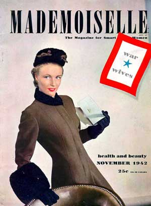 |
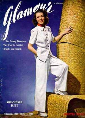
| Glamour, Feb. 1941. Imagine how many cover lines a magazine from 2001 would pack into the empty spaces on this cover. America would not enter WWII until December. | Mademoiselle, Nov. 1942. The war is on. Fashion flourishes. |
-1951.jpg) |
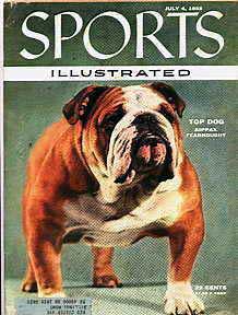 |
| Heute (Germany), 1951. The war is over. Celebrate normality. | Sports Illustrated, July 1955. Today's cover lines are designed to be read at a greater distance than these. |
 |
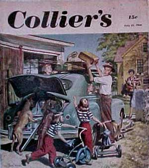 |
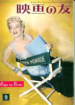
| Eiga (Japan), 1955. Perhaps glamour attracts by promising rewards far beyond anything that can be labeled -- and thus, cover lines would be superfluous and limiting. | Collier's, July 1950. Poster covers do not advertise the magazine's contents beyond a single theme captured in the graphic. Except for an article on family vacations, what else was in this issue? Why didn't readers need to know? |
 |
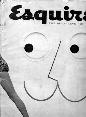 |
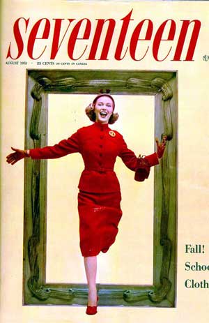
| Seventeen, Aug. 1951. Perhaps the spirit projected by a cover is enough for its readers. But when several competitors are projecting similar covers, cover lines help distinguish each magazine from its competitors. | Esquire, March 1955, reminds us that perception takes place in the imagination and that what is not shown can be more important than what is. |
 |
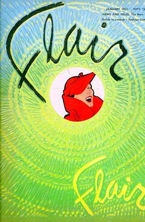 |
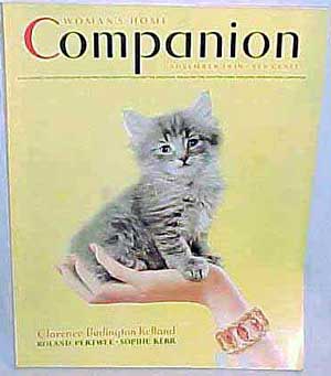
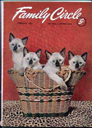
| Family Circle, Feb. 1951. The photo is more evocative than it first appears to be. Kittens suggest children, the basket homemaking, and the leopard tablecloth suggests at once the mother, in her role as supporter and defender, and the maturity the kittens are growing toward. | Flair, Jan. 1951. That's a round hole in the center. The woman in red is on page 3. Note the teeny little hints of cover lines in the upper right. |
 |
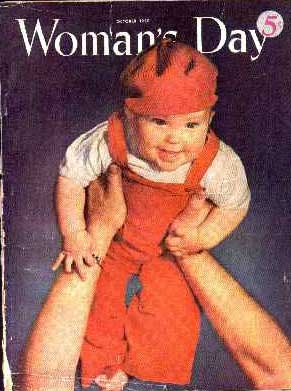 |
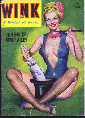
| Wink, Dec. 1952. Compare to Maxim's covers in 2001, with their proliferating cover lines, which somewhat overlAP Test, The image. | Woman's Day, Oct. 1950. The picture asks, "What more needs to be said about a woman's day?" |
 |
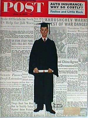 |
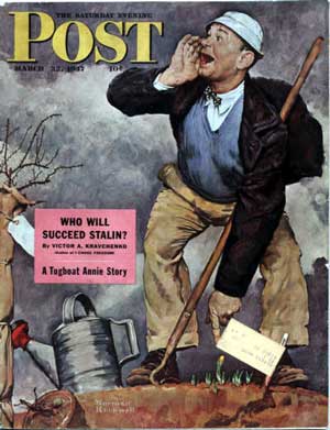
| Saturday Evening Post, March 1947: Hope sprouts anew in a war-torn world. (That thing on his head looks like a sailor's hat converted for gardening.) Norman Rockwell produced narrative art in which readers of the Post could imagine the story that surrounded the illustration and participate in the emotions depicted by the moment. Characteristically, on a Rockwell cover, the magazine allows itself at most a single block of restrained cover lines. | Saturday Evening Post, June 1959. Rockwell continued to produce engaging, effective cover paintings long after photography dominated magazine covers. |
 |
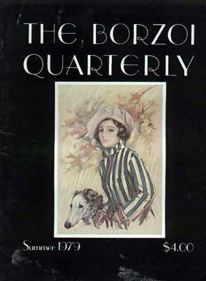 |
| Vis-a-Vis, November 1967: It is striking how rare it is to find a full-sized, full-face picture on a magazine. Even John Denver wears the magazine's logo on his forehead. | Borzoi Quarterly, Summer 1979. In spite of its literary appearance, this is a magazine for owners of Borzoi wolfhounds. The cover shows how a magazine can imitate an earlier fashion in design as a way of establishing its identity. The poster illustration, in the manner of many earlier magazines, is small and strongly set apart by a frame. |
 |
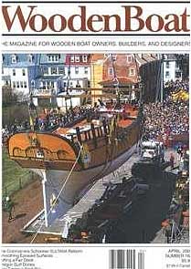 |
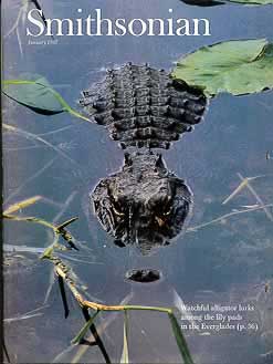
| Smithsonian, January 1987: The thing that gives a cover its special magic, its "sex appeal," depends on the audience. Here, it is this fabulous poster cover of an alligator in the Everglades. Smithsonian is among the small number of magazines with highly educated, upscale audiences, that can risk an almost unexplained poster cover. (It does contain a brief, quiet cover blurb.) | Wooden Boat, April 2002: Some early magazine cover formats survive many decades later because they work so well. This "framed" poster cover has a few modest cover lines in a separate panel at the bottom. No cover lines intrude into the drama of the illustration. |
Return to "Magazine Covers and Cover Lines: An Illustrated History."